Many Austen fans enjoy viewing various early editions of Pride and Prejudice – and many of us are familiar with the famous “Peacock” edition. I recently had the opportunity to hold and examine a very early “Peacock” edition in my very own hands. (It was beautiful!!! I may have squealed in my head.)
During this 250th celebration year of Austen’s delightful works, I thought a little trip down “Peacock Lane” might be in order! This beautiful edition has a rich history and has contributed to Austen’s lasting legacy.
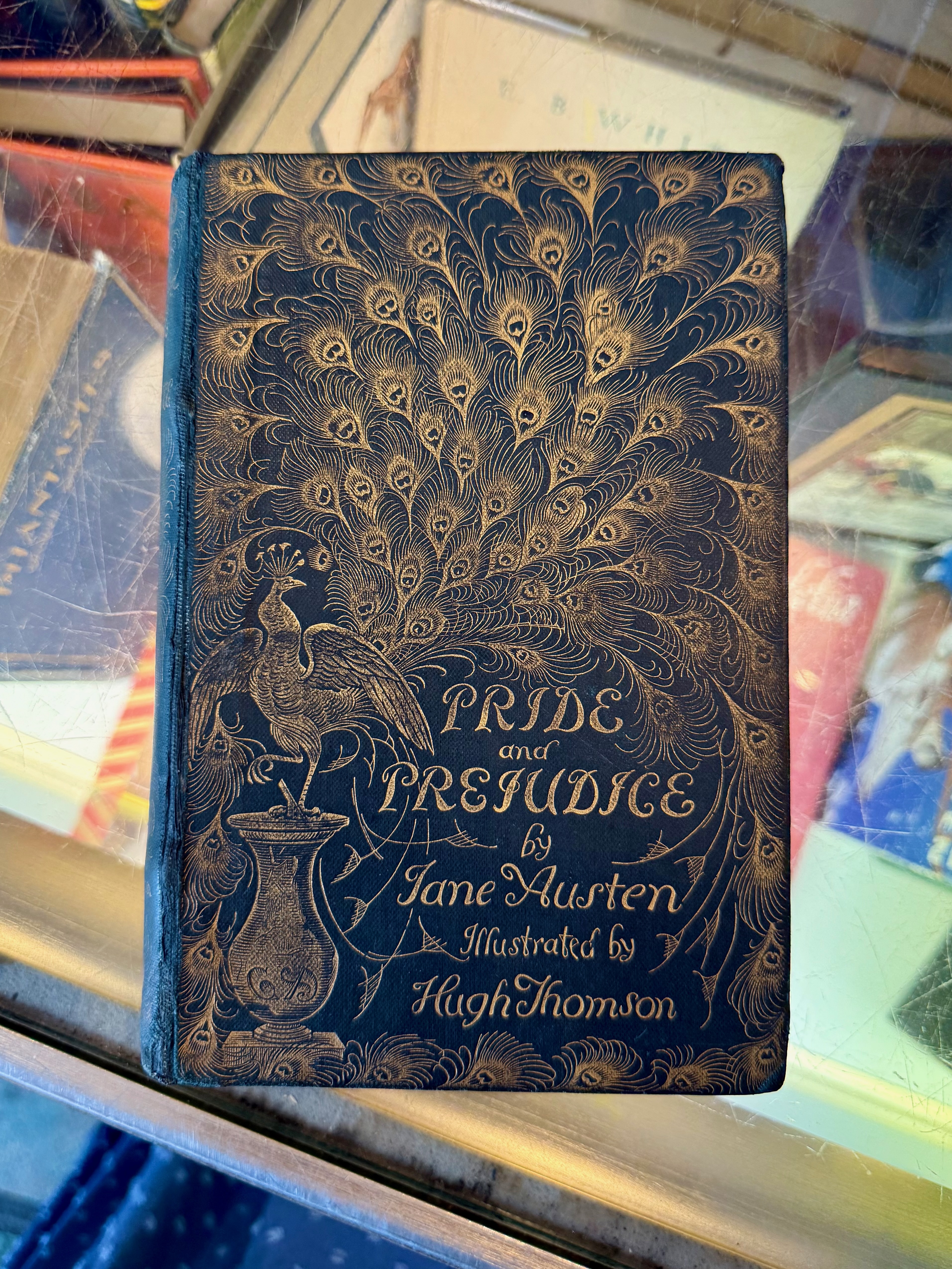
The Original “Peacock” P&P
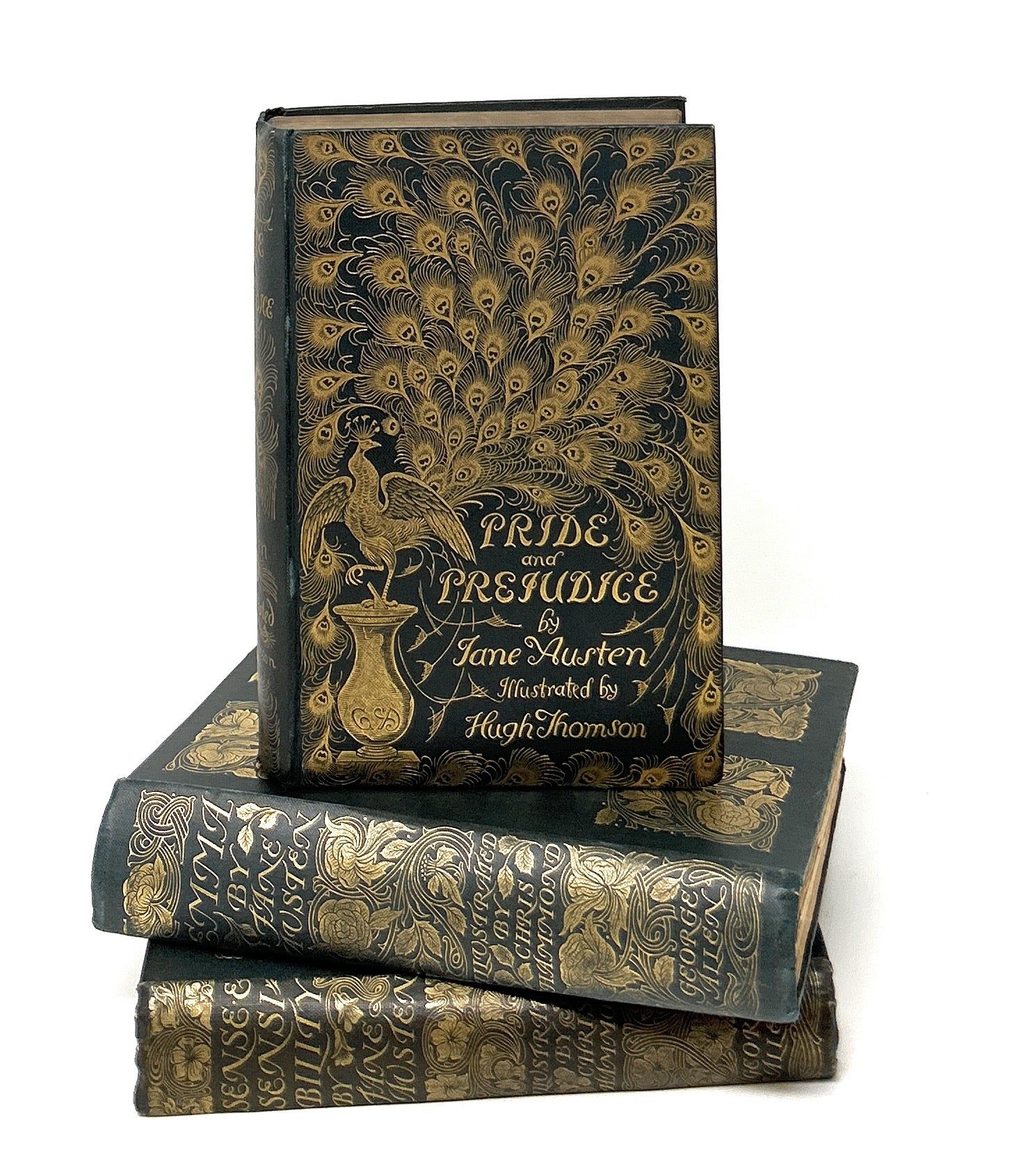
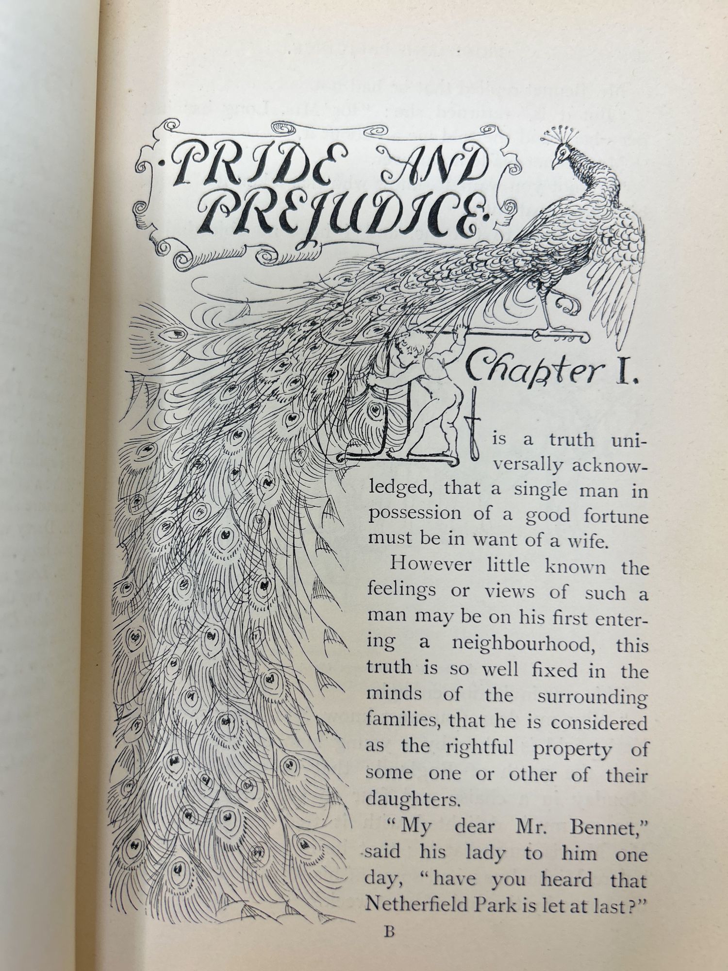
George Allen is responsible for the original 1894 “Peacock” edition of Pride and Prejudice, which includes the now-famous illustrations by Hugh Thomson. It includes 65 illustrations and 160 drawings and designs in total.
According to a University of Michigan Library Online Exhibit, Allen’s “Peacock” edition was not only extremely popular at the time, but it also helped revitalize the popularity of Austen’s works in the late 1800s:
“In reaction to the wave of British nationalism in the late nineteenth century, a renowned publisher of the time, George Allen, sought to preserve traditional English values by publishing a series of illustrated classic works of literature.”
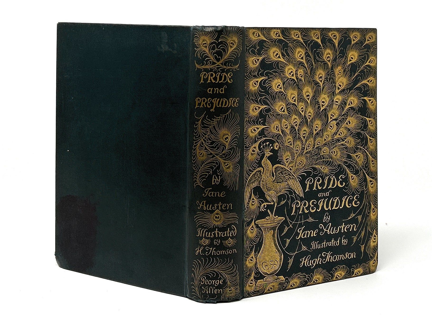
There’s a reason people love the “Peacock” edition. The cover is striking with its deep navy blue background, gilded title, and resplendent gold peacock feathers. Every detail is exquisite:
“The edition’s iconic features include its gilded peacock cover (symbolic of pride) and 65 full page illustrations, all created by Hugh Thomson. As an acclaimed illustrator of the time, Thomson’s work symbolized grace and refinement, which made him the perfect choice for capturing Allen’s vision.”
Allen’s goal to revitalize interest in Austen’s work proved successful, but the edition itself did better than he ever imagined and went on to become an iconic edition that book collectors salivate over today:
“The edition surpassed expectations, selling over 11,605 copies in England and 3,500 copies in the United States, within the first year. Its popularity was partly due to its large appeal across class divisions, gender spheres, and political factions, functioning most basically as a gift book and mark of good taste. George Allen’s revival has proven to be timeless. Thomson’s peacock design has become the iconic representation of Austen’s Pride and Prejudice in contemporary marketing and merchandising, continuing to capture audiences today.”
“Peacock” Illustrations
If Hugh Thomson’s name sounds familiar, you’re right. Jane Austen’s House Museum shares these intriguing details:
“The Irish illustrator, Hugh Thomson (1860-1920), was best known for his pen and ink illustrations and in addition to Jane Austen’s work, illustrated the novels of Charles Dickens, Elizabeth Gaskell and J.M Barrie. Thomson used to visit the British Museum and V&A to research costume styles, room decorations and furniture design for his illustrations. Despite that his drawings for Pride and Prejudice have a distinct Victorian rather than Georgian feel to them.”
If you’ve ever wondered why Thomson chose a peacock for the cover, you’ll find a clue in the old saying, “proud as a peacock.” Male peacocks have long been associated with pride and vanity because of their vibrant plumage and the way they strut about with their feather fanned out around them. Some believe that the peacock’s elaborate display of its tail feathers, especially by the male during courtship, is a fitting image for Pride and Prejudice’s themes of courtship as well. Either way, the peacock as a symbol of pride seems fitting for the cover of Pride and Prejudice.
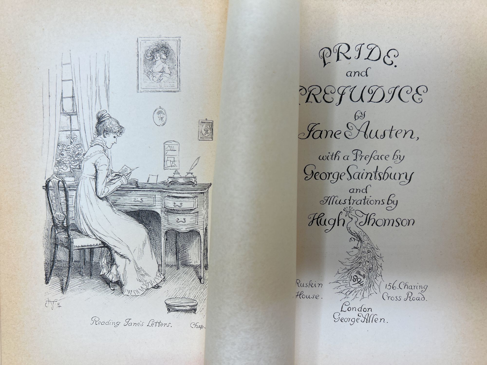
The interior is filled with beautiful full-page illustrations. The first page of the first chapter is particularly lovely with the peacock plumage on full display:
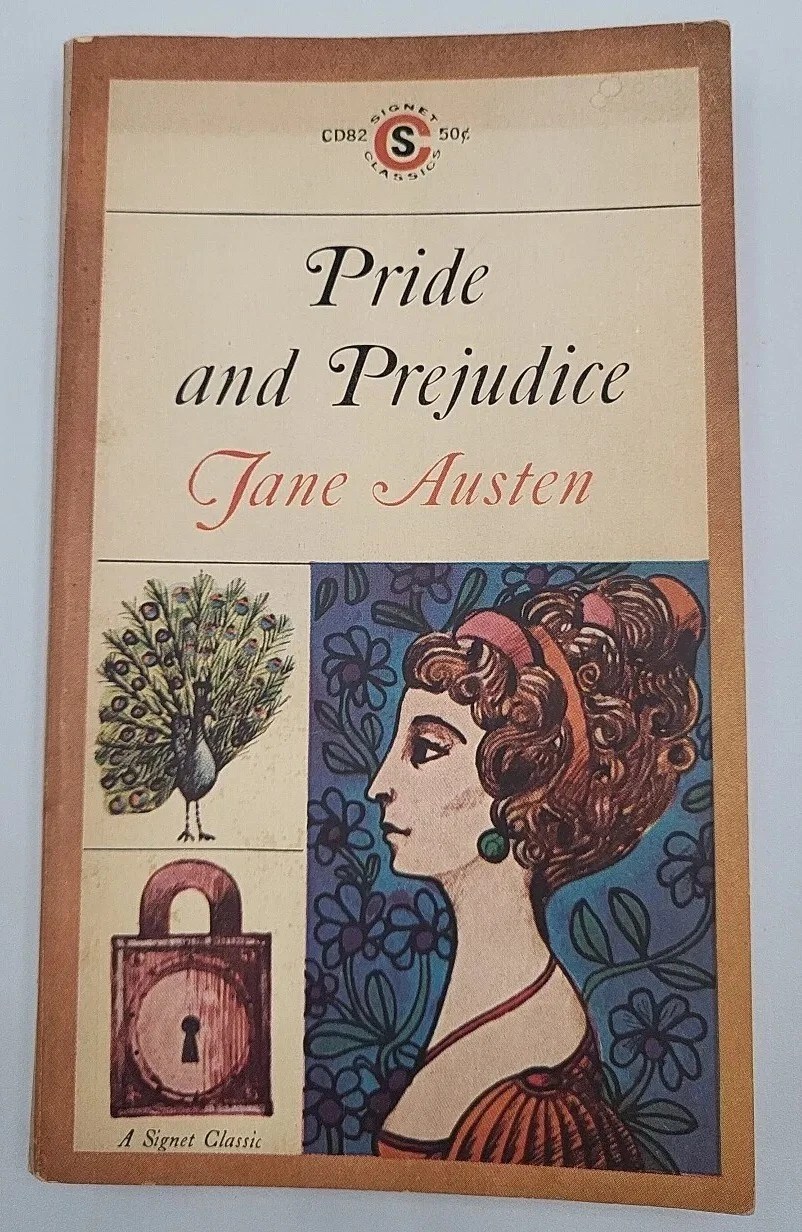
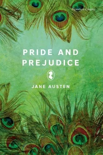
“Peacock”-Themed Editions Through the Years
Ever since the original “Peacock” edition was released, many other editions of Pride and Prejudice have featured a peacock or peacock feathers. Each one is a nod to the original and to the overarching theme in the novel. Here are a few select highlights:
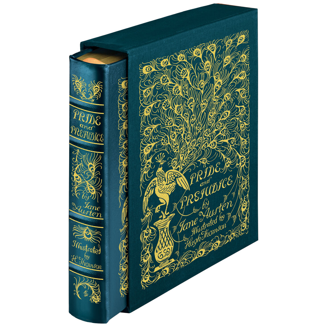
Though the Easton Press leather-bound edition is pricey at $252, it might be worth it to those who want to have a beautiful and exquisitely-reproduced copy of Allen’s original “Peacock” edition with Thomson’s illustrations throughout. It’s truly a work of art in its own right with its “hubbed” spine, sewn pages, acid-free paper, and custom-crafted, clothbound slipcase.
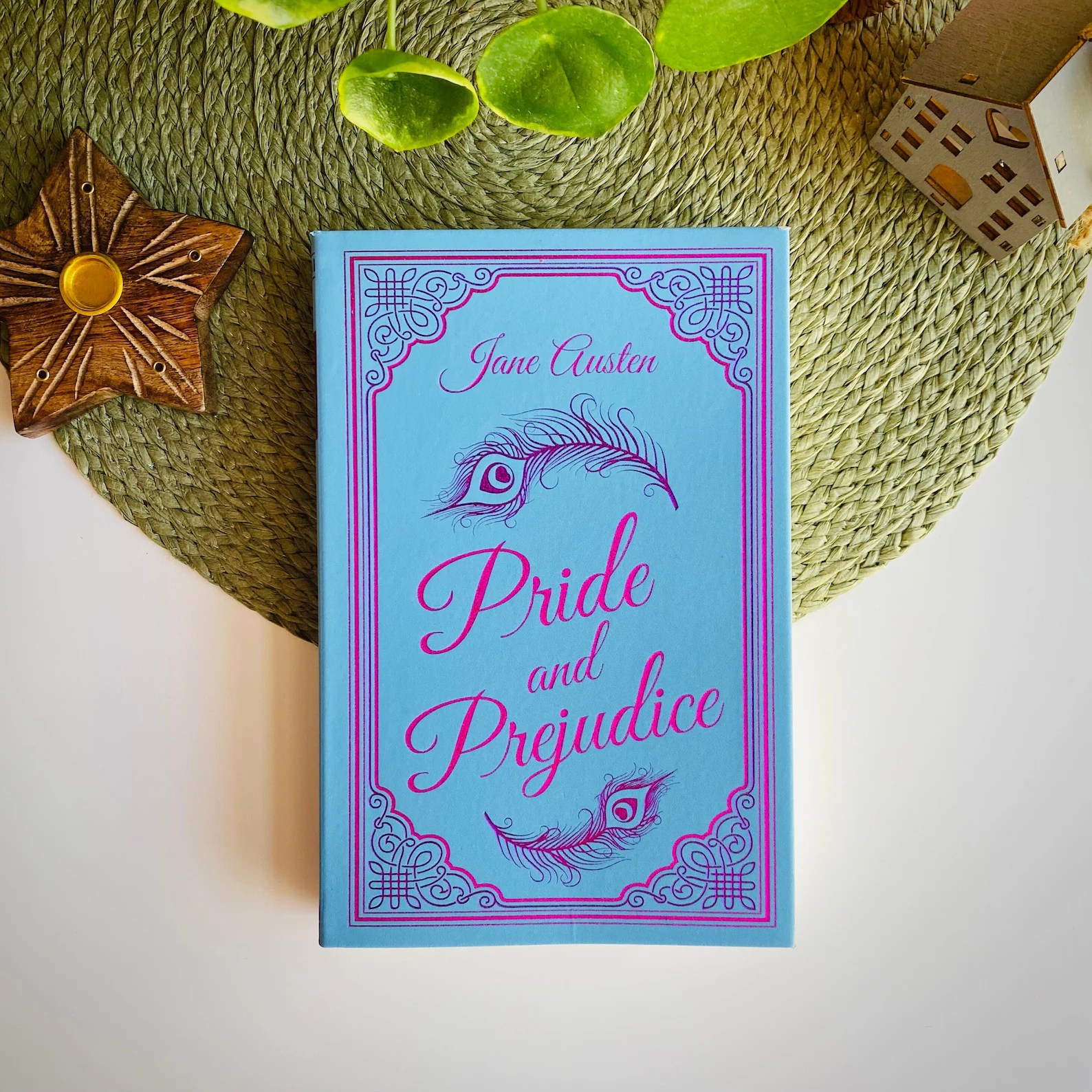
250th Editions Featuring Peacocks
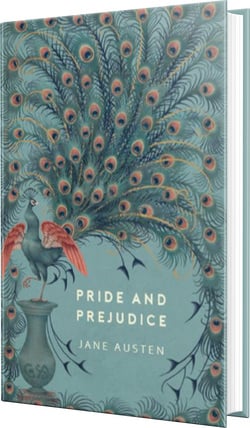
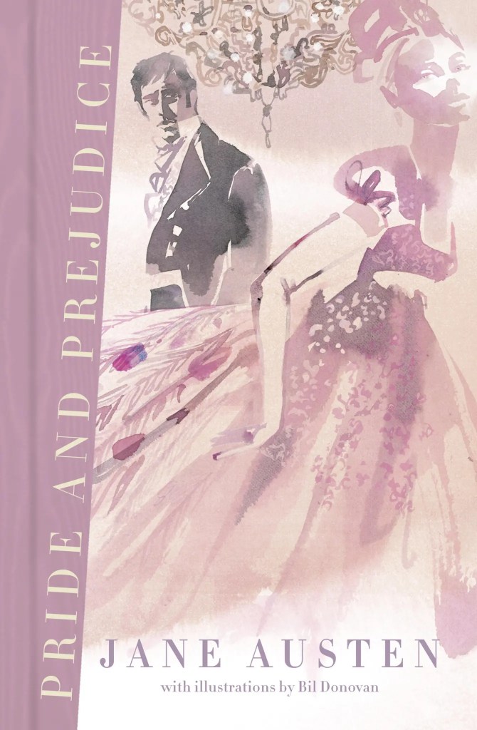
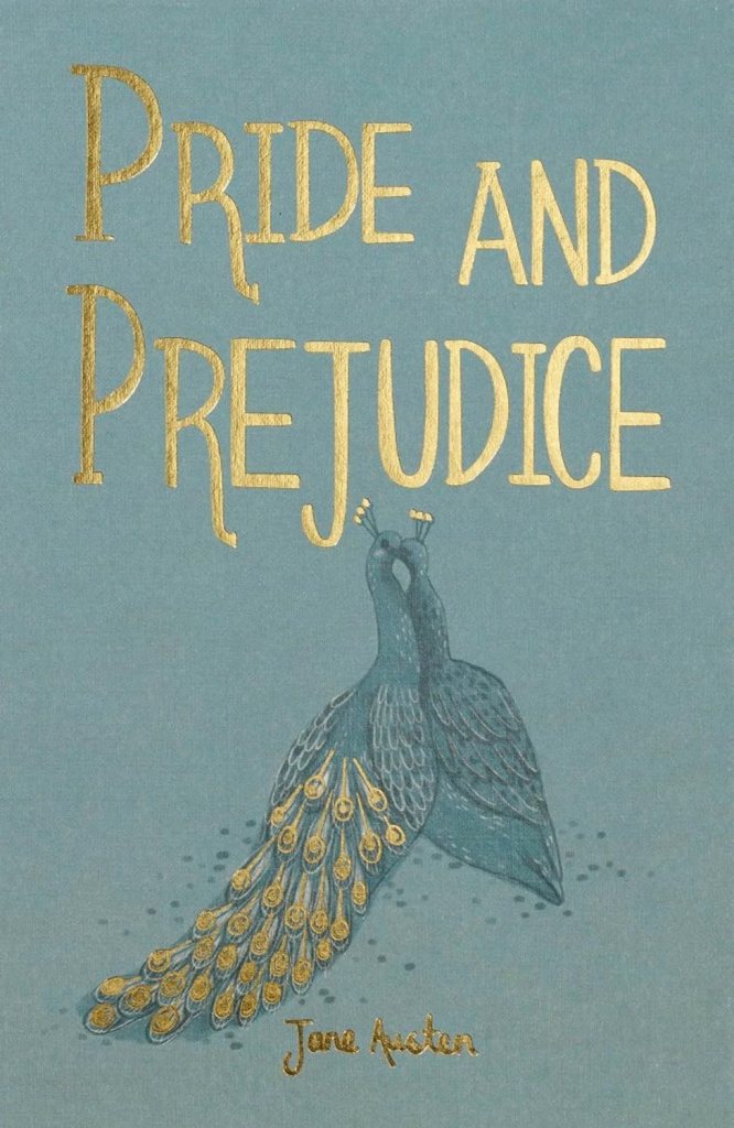
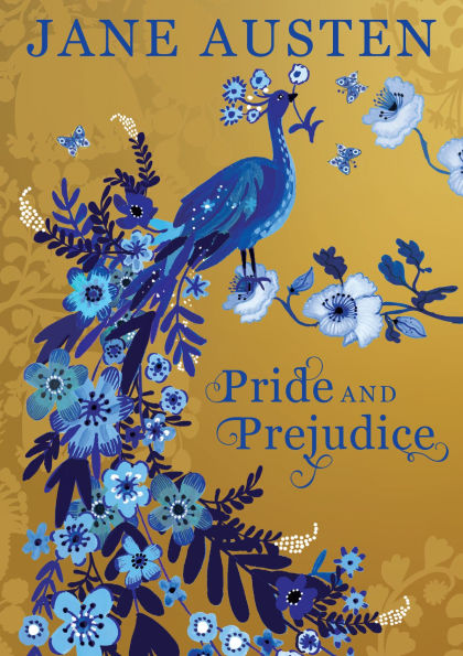
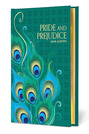
Finally, for the 250th anniversary of Jane Austen’s birth, Austen fans can enjoy several new “Peacock”-inspired editions. These editions pay homage to the original Allen edition with an updated flair. Thus far, I’ve seen these new and upcoming editions advertised:
Proud as a Peacock
Whichever edition you enjoy reading, it’s clear that the peacock remains an enduring symbol of pride in the novel. As Elizabeth Bennet says about Mr. Darcy after he snubs her: “I could easily forgive his pride if he had not mortified mine.”
A copy of the original “Peacock” edition is worth a lot of money these days, but its impact is truly priceless. Allen and Thomson helped revive and sustain popular interest in Jane Austen’s work far beyond what they ever imagined.
RACHEL DODGE teaches college English classes, speaks at libraries, teas, and conferences, and writes for Jane Austen’s World blog. She is the bestselling, award-winning author of The Anne of Green Gables Devotional, The Little Women Devotional, The Secret Garden Devotional, and Praying with Jane: 31 Days Through the Prayers of Jane Austen. A true kindred spirit at heart, Rachel loves books, bonnets, and ballgowns. Visit her online at www.RachelDodge.com.


Stunning! The reasoning behind the peacock edition hadn’t occurred to me but it’s quite apt, and enduring.
Loved learning more about the peacock covers. I have a few of the more recent covers. Denise
When I visited London many years ago, I was able to buy a copy of the Peacock edition–in beautiful condition. I had no idea of its rich history at the time!
This is all very interesting. I am an enthusiast for her work and have been since I was educated in France and learned of Jane Austen as a custodian of Universal Ethics’ values in the European context. I did not believe in English’ values’ as something special and I do not now in the current Obsession of the Anglosphere with their male travesty of the Past. If one can translate Donna Harraway’s rather esoteric concept of Cyberborg into the English language I suspect Jane Austen and Mary Wollstonecraft were closer to the Truth than the corrupt Judges of the USA Supreme Court that have rendered the English language meaningless by allowing Donald Trump to make a travesty of the USA Constitution, to make Oaths nonsense, and an American rabble to go through an absurd for travesty of election and reach an absurd conclusion. I do not believe there is such thing as English Values and I do not believe the Present English or American people know what Values are except as ‘mystic confabulation of utter Fascist drivel
Benedict Cowell
Rachel, thanks for your survey of P&P peacock editions. I’m glad you mentioned the Easton edition. Though it is expensive compared to other modern editions, it is cheap compared to the original. It’s a book you can handle, read, and enjoy (especially the illustrations) without worrying about damaging a fragile older book. (Apologies for the advert for Easton, but it’s a joy.)
I work in a Special Collections at an academic library, and while planning a Jane Austen exhibit for the fall I’ve just stumbled across our original copy of the peacock edition! I had no idea we had it and I’m so excited to put it in the exhibit.